Component Editor Details
The detailed view of the component editor is divided into four tabs:
- View: Set the visual representation of the component.
- Data: Set the attribute values for the interaction between the component and the system.
- Event: Define actions based on component events.
- Permission: Configure component access and functionalities based on user permissions.
View

Common Attributes
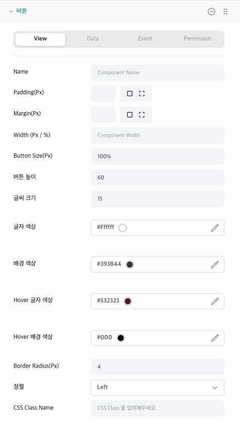
- Name: Set the name of the component that will be displayed in the system. If left blank, the default component name will be displayed (e.g., Button).
- Padding(Px): Configure the padding for the component. Set it universally or adjust individually. Only numbers can be input, and the value is in pixels.
- Margin(Px): Configure the margin of the component. Set it universally or adjust individually. Only numbers can be input, and the value is in pixels.
- Width(Px/%): Set the width of the component. If you only input numbers, the value will be in pixels. If you include a percentage (e.g., 30%), it will be applied as a percentage.
Inner Grid Attributes

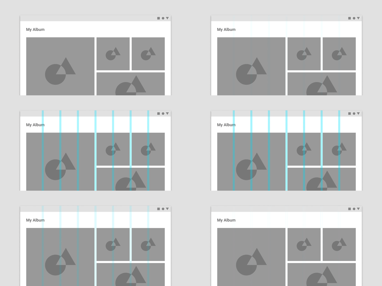
- Component Grid Count: The Grid Count value inside the Component Group Grid Item. In the WEVY system, there's another grid inside the component group, allowing for diverse layout configurations. Here, there are also
12grids.

- Component Grid Index: Set which grid area the component will occupy. If the Grid Count is set to 2 in the component group, there will be 2 indices,
0,1. If Grid Count is less than 2, the index is automatically set to0.
Component Specific Attributes
Attributes outside the Common Area and Inner Grid Attributes are specific to each component. For detailed information, please refer to the individual component descriptions.
Data
In the WEVY system, the data section is pivotal, allowing for integration with the system. Through this section, users can manually adjust the displayed data or easily fetch database information via the API->Connection Data Store.

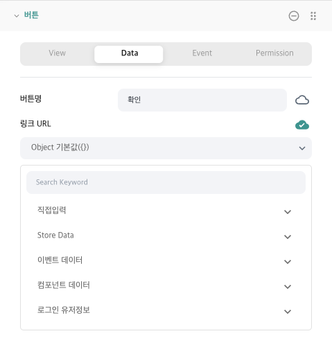
Data can inherently have a static value. Depending on various component attribute types, inputs can be made, and a range of data sources can be chosen through the data integration button on the right.
- Direct Input: Data can be input in Code(Javascript) or Text format.
- Store Data: You can choose data stored in the store.
- Event Data: Integrate values returned from specific component events.
- Component Data: Acquire attribute values from other components.
- Login User Info: Integrate user information from the WEVY system, including User Id, Email, and Name.
Direct Input

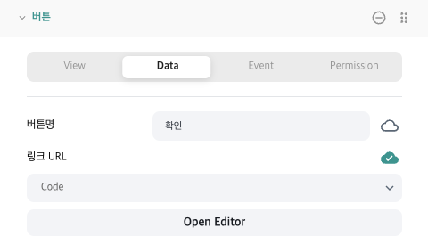
Upon choosing the code, the Open Editor screen appears, and clicking on it opens the Code Editor.
Store Data
You can select desired data from the stored store data. If you wish to change the format of the store data or apply additional logic, use the code editor.
Event Data
Events occurring from the component return data, and in WEVY, this can be utilized through linking with the data store. As each component may have a different event data format, it's recommended to suitably transform it using the code editor.
Component Data
You can fetch and use attribute values from other components, allowing for consistent management of various component values.
Login User Info
Access is possible to user's Id, Email, and Name.
Event
For information regarding events, please refer to the Component Event - Event link.
Permission
With the permission feature, you can adjust the visibility and functionality of components based on user permissions. The default options for component visibility are No Permission and Non-member. Additionally, permissions set up in the system settings can be displayed.
The permission settings related to specific features of each component may vary. Thus, for detailed explanations of each feature, refer to the component's documentation.